Vizmap and Filter Redesign : ... |
Editor(s): ... |
<<TableOfContents: execution failed [Argument "maxdepth" must be an integer value, not "[2]"] (see also the log)>>
About this document
This is an official Request for Comment (RFC) for redesigning the Vizmap and Filter user interfaces.
For details on RFCs in general, check out the Wikipedia Entry: Request for Comments (RFCs)
Status
05/24/2007 - Moving to test phase. Need to update this page (screenshots, etc.)
05/02/2007 - UI activated. Most functions are working. Need some tuning for the detail.
04/19/2007 - New backend/GUI code checked in, but new UI is still hidden from user.
03/06/2007 - Basic design is complete. Need to optimize the design based on other developer's comment.
1/17/07 - Not yet completely written. Start writing actual implementation plan.
How to Comment
To add comments, use Comment section below.
Try to keep your comments as concrete and constructive as possible. For example, if you find a part of the RFC makes no sense, please say so, but don't stop there. Take the extra step and propose alternatives.
Proposal
Visualization of networks is Cytoscape's reason for existence and Cytoscape fittingly provides powerful features for changing and managing the visualization of networks. However, many of these features are hard to use individually and in concert with other features. As a result of this general difficulty users have expressed frustration with the system. This was made apparent during the usability working group at the 2005 Cytoscape retreat and in a survey presented to new users of the system.
Therefore, we propose to redesign the Vizmapper and Filtering interfaces with the goals:
- Conceptual clarity. Clearly define the goal of each dialog/step/action in terms of intended use cases.
- Simplicity. Provide clear options, make next steps apparent, reduce available options when possible.
- Consistency. Whenever possible maintain a similar layout/behavior for similar functions/tasks.
- Maintain the current feature set.
- Flexibility. Create an extensible design that will allow for new features to be added in a way that doesn't violate goals 1-3.
- A design that is easy enough for beginners to figure out, but rich enough for experienced users to accomplish their goals.
- Accessibility. Make functionality visible/accessible to user, provide affordances so that user can recognize the accessible functionality, rather than have to memorize particular actions.
- Responsiveness. Changes should be immediately effected where possible (minimize need for an ‘apply to network’ button).
- Reversibility. It should be easy to undo and redo changes in a highly interactive way.
The new Vizmapper UI is a part of Cytoscape 2.5 features, which will be available in 2nd Q of 2007.
Biological Questions / Use Cases
High Level Use Cases
I want to compare and contrast nodes/edges, e.g. I want to have nodes/edges that meet certain conditions ‘stand out’.
I want to see trends for nodes/edges over conditions (attributes), e.g. changing expression values over a time series.
Lower Level Use Cases Implied by High Level Use Cases
- I want to change the {node|edge} {shape|color|etc} based on data attribute XYZ.
- I want particular {nodes|edges} to be highlighted a particular way.
- I want to change the appearance of my selected {nodes|edges}.
- I want to {modify|layout|delete|???} of just a selected set of {nodes|edges}.
- I want to select all {nodes|edges} that match a particular pattern.
If attribute X is in between n1 and n2 AND attribute Y is abc, then I want to change the color to C1.
General Notes
Definitions
Network visualization amounts to the graphical representation of raw data. The raw input data consists of node network data, edge network data, node attribute data, and edge attribute data. Node and edge network data only define the topology of the network. Node and edge attribute data associate supplemental information with the node and edge network data that define the topology. To create a visualization, this input data is mapped to graphical elements (circles, squares, lines, etc.) and displayed on a computer screen. Creating this mapping is what this RFC is about.
General Concepts
Fundamentally, there are three distinct conceptual acts involved in altering the visual appearance of a network.
- Selecting the input data that should be used to define the alteration.
- Selecting the graphical element that should altered.
- Defining the mapping between the two.
1. Input data consists of two primary types: network and attribute.
The selection of network data is a binary selection. You've either selected an node/edge or not. This binary representation makes the mapping to graphical element (step 3) relatively straightforward. You simply define how a graphical element is to be altered if the associated data is part of the selection. How you go about selecting the data however is where things get interesting. Currently there are three ways of selecting data.
- Select all data.
- Hand select a subset of data using the mouse (i.e. Drag-select or click on particular nodes or edges).
- Use a filter to select a subset of data based on attribute or network data.
Once the selection of data is accomplished we know which nodes and edges the graphical changes will be applied to, but we still don't know how the changes will be applied.
2. Selection of graphical elements is relatively straightforward and is only limited by what Cytoscape can render. What is useful to consider is not the myriad types of graphical elements, but what each is able to communicate. In general, there are two types of data, discrete and continuous. Some graphical elements lend themselves well to one, but not the other. For instance color gradients and size are good at representing continuous variables because there is a simple function mapping the domain of the variable to the range of the graphical element. Other elements, such as shape, are less well suited to continuous variables because there is no natural mapping between the discrete number of shapes and a continuous variable. However, discrete variables, like species, are well suited to limited graphical elements like shape, line type, etc.
Nominal (categorical), ordinal, interval, and rational data. See http://www.psychstat.missouristate.edu/introbook/sbk06m.htm for descriptions of the different types. It is worth considering whether to present discrete/continous data options as the different types of measurements instead of or as well as discrete and continuous options.
3. Mapping the data selection of step 1 to the graphic selection of step 2 results in the final visual representation. Mappings can be one of three types:
- Discrete - The data values being categorized are grouped with like values and each group is assigned a specific highlight. For instance any node with a value of 1 is square shaped and and any node with a value of 0 is circle shaped. Discrete data can be textual or numeric. Even continuous data can be treated as discrete with each datum represented by a specific mapping.
- Continuous - Continuous data can be treated directly with graphical elements like node size or color gradient. It can also be transformed into a discrete variable by assigning intervals to the range of variables. Continuous data can only be numeric.
- Pass Through or No mapping. Pass Through mapping means that the variable isn't mapped onto a graphical element, but that the variable is used directly by the graphical element. The primary use of a pass through mapper is for attribute data to be used to label nodes and edges.
How Vizmapper and Filters Fit into Cytoscape
Cytoscape has three primary modules, the network data (CyNetwork), the attribute data (CyAttribute), and the visual representations. Filters only affect the selection of nodes or edges from the network data model, however they can use attribute data to provide filtering criteria. The Vizmapper, however, only operates on the underlying attribute data model, although data selected with filters (or by hand) can be used to create or alter attribute data.
The visual representation is affected by both the network and attribute data. Network data is used to determine the layout of the graph while attribute data is used to style the graph.
Possible Designs
- Current Design:

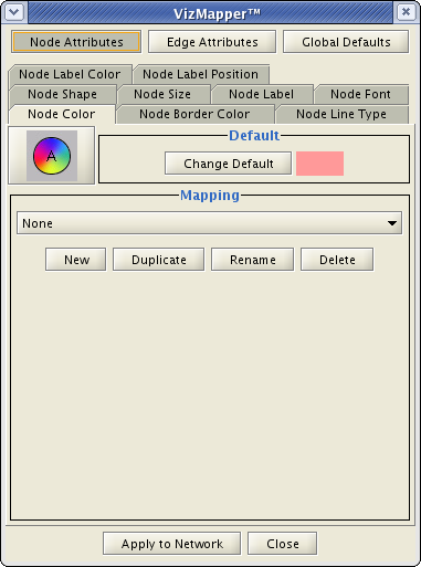
The first window will be removed. The function like New or Delete will be a part of new toolbar or menu command in the new VizMapper UI.
Second window will be a part of one of the CytoPanels.
Key design goals
- Provide a clear overview of the mappings that each visual style contains. The point of an overview is to allow the user to gain mastery of the visual mapping system by giving them a clear path from the data behind the scenes to the visualization of the network. The overview should contain all of the relevant information: the data attribute, the visual attribute, which nodes.edges are selected. For example, if your visual style only define mappings for node shape and size you might see something like:
- My Visual Style
- Node Shape -- Species -- All nodes
- Node Size -- p-value -- XYZ filtered nodes
- My Visual Style
- Provide consistent steps for changing visual attributes.
- Only show what is needed. If a data attribute is discrete, only show discrete mappings.
- Make sure it is apparent what the current settings are.
1. A standard wizard interface. The vision is to roughly follow the steps above with separate screens (within the same panel so we're not spawing new windows for each click).
- Begin with a page that lists the possible visual styles with the current style clearly highlighted. This page might include a summary of the rules the style contains or provide a link to one.
- Ask the users to select the data attribute to map.
- Ask the users to select the nodes/edges to apply the mapping to.
- Ask users what visual attribute they would like the mapping to apply to. This function should be smart enough to limit available options to what the data attribute can naturally represent (i.e. discrete implies shapes, colors; continuous implies size, color gradient).
- The final page of the wizard will be something similar to what we see in the tabs now. This is where you'll define ranges for the variables, etc.
- Finishing the wizard returns to the start page.
* Advantages
- Should be easy for people to follow.
* Disadvantages
- Might slow expert users down.
2. A Tree (JTree) type interface. The levels of the tree would include the available styles, available visual attributes, available data attributes, and a final page that allows users to tweak a particular setting. It isn't entirely clear to me how the levels should be ordered. * Advantages
- The tree itself can provide a summary of existing mappings.
- Allows expert users to quickly click to where they want to go.
* Disadvantages
- Trees can be tedious to navigate as they frequently "explode" providing much more information than can fit in a screen.
3. Same as the Tree interface, but using a Mac OSX finder column paradigm.
4. Implement a DynamicQuery interface, a la SpotFire, InfoVis toolkit, as an alternative filtering capability. Use a set of RangeSlider widgets, one per desired attribute, with filtering performed by an ANDing of the individual attribute/slider queries. Have filtering result in hiding/showing of nodes, rather than selection of nodes. The InfoVis toolkit has classes for Dynamic Queries and range sliders, that we can utilize.
This function is partially implemented by Quick Find Plugin introduced in version 2.4. Remaining issue:
How can we chain the Dynamic filtering result? This means create selection by AND operation between dynamic filtering results.
- How can Quick Find and Filter plugin communicate each other?
5. Come up with other examples of interfaces for building logic statements for Filters. Ethan is collecting this list for research.
- Perfuse
- Infoviz
- Protege
- Endnote
Others?
Possible New Features
- Combine multiple attributes by creating new attribute called filtering result.
- Transparency control slider
Time Slider: Slider to switch attribures. Will be used to view array data.
- Arbitrary line width. This includes edge and nord border.
- Separate arrow type and arrow color
- New arrow head types
Reverse Arrow Head ( --< )
Double ( -->> )
- Box ( --[] )
Crow ( --<- )
Requirements
Required Changed to the Backend
1. New Calculators VizMapper manages each of visual properties with Calculators. To support arbitrary line width and arrow color, we need the following new Calculators:
2. Re-organized classes for line and arrow
(under construction...)
Deferred Items
Open Issues
Move vizmap and filter interfaces into CytoPanels.
- Currently, Cytopanel 3 is not in use, so maybe we can place them in it.
- Computed attributes, i.e. combining mappings in expressions.
- Data preprocessing, e.g. to assign mapping types and ranges based upon statistical shape of the data.
Evolution versus revolution: Can we keep the vismapper model intact while implementing new user interfaces for manipulating it? If so, then we can implement many of these enhancements as plugins, allowing users to continue using VizMapper classic as the default?
- There are several visual attributes where it makes sense to manipulate the attribute directly on the network. The example that brings this to light is node label position. It would be nice to be able to click on a node and then, through some mechanism, directly move the node label to the desired location on the screen. The trick here is integrating this movement with the potentially existing visual mapping.
- How do custom node graphics fit in?
- How should local visual attributes be dealt with? E.g. the user can select any visual attribute for a node or edge and the visual mapper should respect it.
- How should node label position be incorporated with the vizmapper?
- Do we need to support transparency (alpha-ch)?
Backward Compatibility
- Chages to the backend code should be minimal.
- In the new version, we will support arbitrary line width (for node border and edge). This should not break XGMML reader and writers.
Expected growth and plan for growth
References
Web Resources
Nielsen’s 10 usability heuristics, http://www.useit.com/papers/heuristic/heuristic_list.html
Ben Shneiderman’s “Eight Golden Rules of Interface Design”, http://www.cs.utexas.edu/users/almstrum/cs370/elvisino/rules.html
Bruce Tognazzini's "First Principles of Interaction Design", http://www.asktog.com/basics/firstPrinciples.html
Apple user interface guidelines, http://developer.apple.com/documentation/UserExperience/Conceptual/OSXHIGuidelines/XHIGIntro/chapter_1_section_1.html
Jeff Johnson’s GUI bloopers, http://www.gui-bloopers.com
Card, MacKinlay, and Shneiderman’s “Readings in Information Visualization”, http://www.cs.umd.edu/hcil/pubs/books/readings-info-vis.shtml
There is also a nice little annotated bibliography at http://www.cs.utexas.edu/users/almstrum/cs370/elvisino/ann_bio.html#9
Books
"Designing the User Interface" by Ben Shneiderman, http://www.amazon.com/gp/product/0201694972/104-8618736-1880752?v=glance&n=283155
"The Human Factor" by Kim Vicente, http://www.amazon.com/gp/product/0415970644/104-3362403-2293568?v=glance&n=283155
"The Design of Everyday Things" by Don Norman, http://www.amazon.com/gp/product/0465067107/ref=pd_bxgy_text_b/104-3362403-2293568?%5Fencoding=UTF8
Implementation Plan
(Tentative)
- Phase 1: Build Mockups - Jan. 2007 (Mostly done.)
- Based on the discussion above and notes from Cytoscape Retreat 2006, build some mockups.
- Phase 2: Refine Design - Feb. 2007
- Modify the GUI design based on core developer's feedbacks and finalize it.
- Phase 3: Integration - Feb. 2007 - Mar. 2007
- Phase 4: Testing and Tweaking
Actual Design
The prototype Vizmapper UI has 5 main components:
- Global Panel - This replaces the current dialog box which pops up when user click VS icon.
- Sample Design:

- Property Selection Panel - This can be attribute-oriented or visual-property oriented.
- Sample Design:

- Value Explorer/Browser - User can browse multiple attribute-property combination.
- Sample Design:
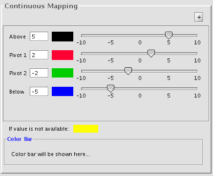
- Value Editor Panel - This is an improved version of current continuous/discrete mapping editor.
- Sample Design:
- Interactive Slider (Movie Player) Panel - New function in 2.5. Mainly for switching attributes over time series.
- Sample Design:
Panel Designs in Detail
The following is sample mockups for new panels.
- Sample 1 (implemented as Cytopanel 1)
All sliders should be interactive. Do not have to click Apply.
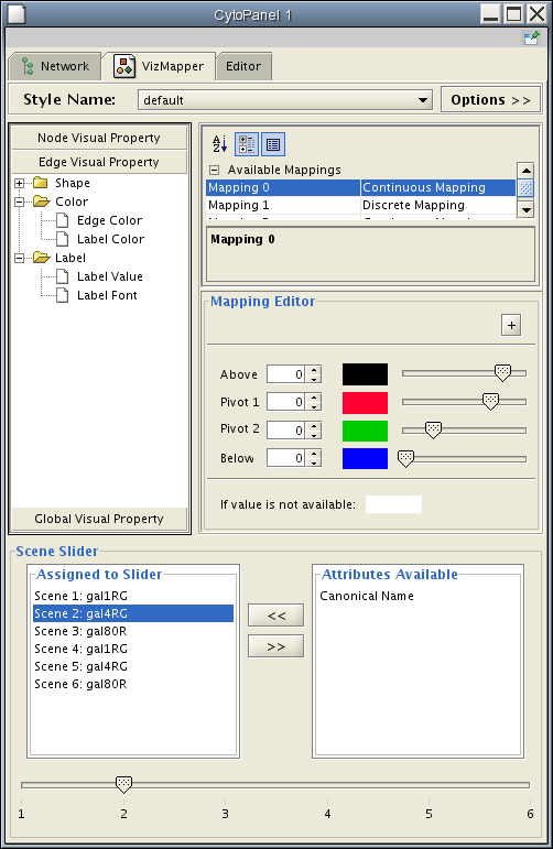
- Mockup 1: Visual Attribute Oriented Design
First, user select one of the visual attributes (Node Color, Edge Line Type, tec.) and then assign node/edge attribute for the visual property.
- Mockup 2: Attribute-Oriented Design
- User need to select a node/edge attribute first, then assing one of the visual attributes to it.
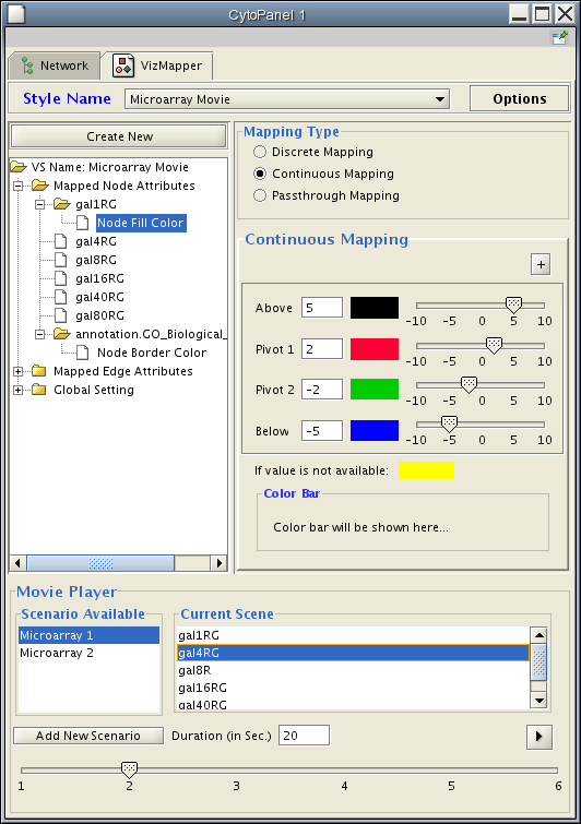
- Mockup 3: Hybrid Design
- Left panel shows attributes that are already assigned to visual attribute, and right panel is visual-property-oriented tree. These two panels should be synchlonized.
- Can browse multiple visual attributes.
Movie Player will be put on Cytopanel 3 or 4.
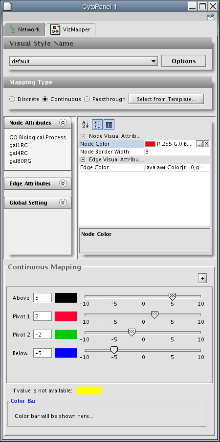
- Mockup 4: Multi-panel Design
New Vizmapper is too big to fit into one panel. We need to split them into 3 panels: Main UI (Visual Mapping Browser and Default Value Viewer) on CytoPanel 1, Continuous Mapper on Cytopanel 2, and Movie Player on Cytopanel 3.
This is the basic design used in version 2.5.
- Still need to optimization, including panel size, additional components, etc.
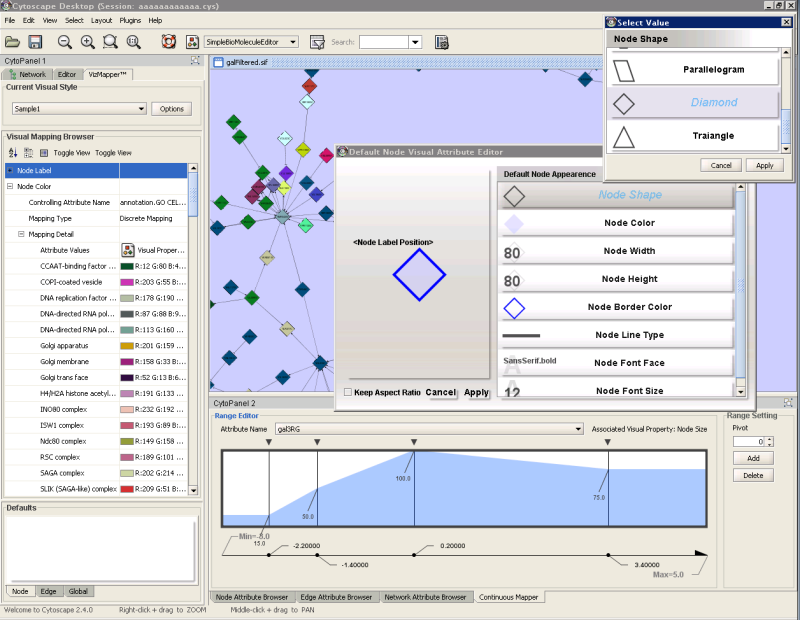
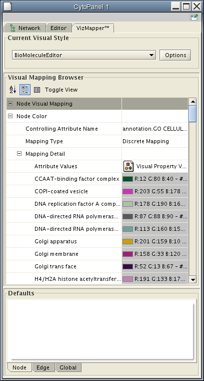
The following is the main panel of new VizMapper. This includes visual mapping browser and default value panel. User can edit discrete mapping directly from browser. Default value will be displayed as graphics on the bottom of this panel (currently empty).
- Continuous Mapping
- Continuous mapper consists of 3 types:
- Gradient editor
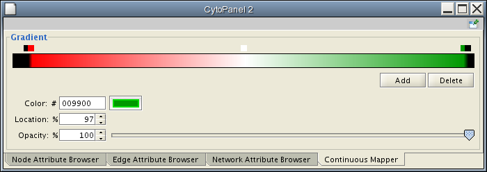
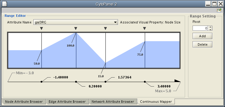
- Continuous Visual Property editor. Mainly used for line width and node size.
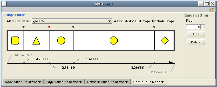
- Discrete Visual Property Editor.
- Gradient editor
- Continuous mapper consists of 3 types:
- Discrete Mapping
- Multiple selection should be supported in the table.
- Optimize randomization algorithm
- Editing will be done in the Visual Mapping Browser.
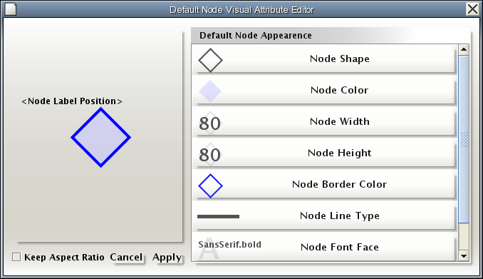
- Default Value Editor
- Instead of showing individual visual attribute, actual view of node/edge will be shown as graphics.
- The following UI is used to edit the view.
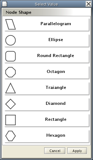
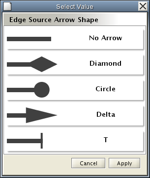
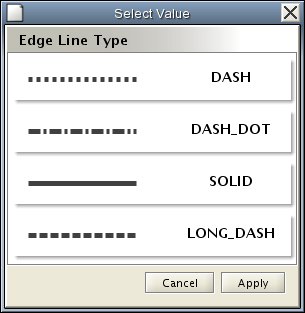
- Icons will be created form rendering engine. User can select those values from the following lists.
Combining Multiple Attributes
Cytoscape cannot combine multiple node/edge attributes and assign one visual attribute. (example: Change node color to red if GO_Biological_Process = x AND species = yeast, or Change node shape to triangle if numerical attribute A is in range X, and numerical attribute B is in range Y.)
However, Filter plugin can do this type of selection by chaining conditions. If we can use the result of filter selection, VizMapper can map multiple attributes onto single visual attribute. The following is one solution:
- Select group of nodes/edges based on multiple attributes.
- Create a new attribute X based on the selection.
- Use attribute X to assign one of the visual attributes.
Remaining Questions
- Currently, users can select "Mapping" from combo box. Do we have to keep this feature, or assign only one mapping per visual attribute? (see mockup2)
If we put all functions into one panel (probably CytoPanel 1), the size of GUI will be too big for laptop users. Should we separate some functions to other CytoPanel?
If we use Attribute-Oriented style (something like Mockup 2), how can we keep Movie Player Panel and the tree view panel consistent?
Comments
be-pfbh203-2 - 2007-01-18 11:45:02
Looks great - here are two additional points.
First, one thing that's useful but cumbersome with the current VizMapUI is mapping a continuous attribute into a discrete range. One example is setting node shapes according to expression P value. The input variable is continuous, but it falls into ranges within which there is discrete meaning (i.e. significant, not significant).
Second, there's the thing that's impossible with the current vizmapper UI, which is setting visual properties according to a combination of attributes (e.g. high expression value AND significant p value).
- Melissa
be-pfbh203-2 - 2007-01-18 11:46:24
I like the idea of something like the Mac finder column paradigm. It reduces the orientation problem that you get with large trees under JTree. Is there Swing support for this kind of user interface element?
Also, I seem to remember that you used to be able to display JTrees as a set of concentric boxes, with children embedded in parents. But I can't seem to locate any information about that right now. Perhaps the feature was done away with (which might tell us something about the perceived utilizy of such a feature...).
AllanK
(These two comments are copied from old comment page.)
AllanKuchinsky - 2007-01-26 11:03:08
Another alternative we might want to consider for the vizmapper interface is to make it attribute-oriented, as is done in Spotfire. Our current approach, and the approach of many other systems, is to orient around visual property, e.g. one panel devoted to defining node color, etc. In Spotfire, the visual mappings control panel is set up to show all of the mappable attributes for a data item and all of its mappings. They have several examples of this in screen shots on their web site, the clearest one I think is the screen shot at http://www.spotfire.com/products/decisionsite_lead_discovery.cfm
KeiichiroOno - 2007-01-26 12:25:41
Hi, Allan. > make it attribute-oriented
Good point. I'll make another mockup which is attribute-oriented.
Kei
AllanKuchinsky - 2007-01-27 13:55:16
Hi, Kei --
I like Mockup2, which shows attribute-oriented design. I think we'd get additional usability if we had a display which showed multiple attributes, each mapped to a visual property, as is done in the lead_discovery screen shot on the Spotfire page I pointed you at.
KeiichiroOno - 2007-01-29 16:55:59
Hi, Allan.
Yes, probably we need to add functions to show the following information:
1. Default values - visual attributes which will be applied when no mapping is available.
2. Support for multiple attributes - as you mentioned in your comment.
I'll make another mockup to add these features.
Kei
nebbiolo - 2007-02-01 11:14:38
I just suggested to Kei that we provide an option that toggles the display between the attribute data -> visualization presentation and the visualization -> attribute data presentation. I think both perspectives have value and if we're clever about how we design things, it shouldn't be too hard to accomplish.
